


The use of colour in branding is a topic that has been widely disputed for decades. However, in travel PR, we know that many people will make an instant association between a shade of red and Coca-Cola, or a black apple and their iPhone, or yellow arches and McDonalds. The same can be said in aviation. The colour orange instantly makes us think of easyJet, and red turns our attention to Virgin Atlantic or Emirates.
Many factors can affect a person’s response or attitude towards a particular colour, for example, culture, geography, upbringing or just preference. However, there are some general rules of thumb to follow when thinking about what colour palette to use when promoting your brand.
The first impression of a brand is often down to colour and using the right colour can make the right people receptive to you. The choice of colour can be used to convey an emotion, feeling or memory and it is important that this fits in with your strategic positioning.
To the science of it
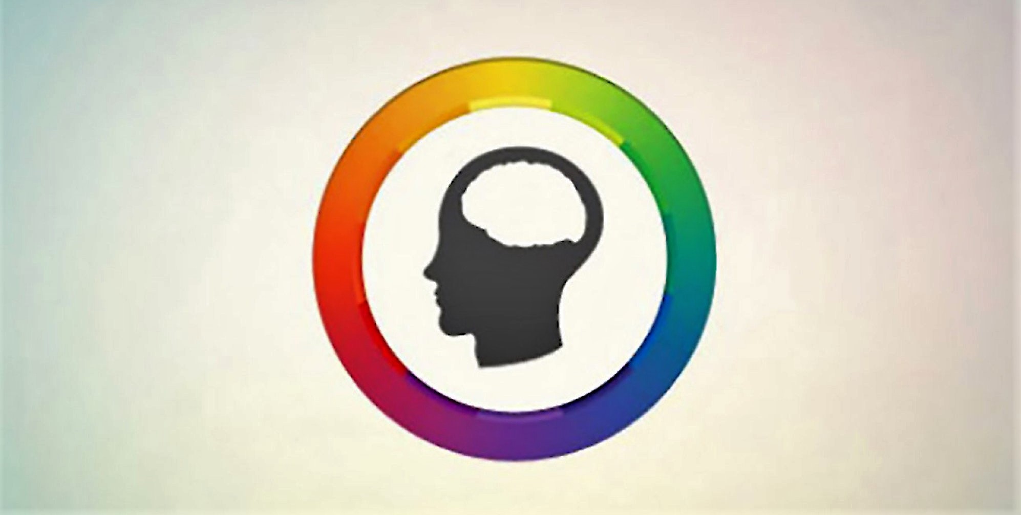
When we identify a colour, an instant chemical reaction in our brain produces an emotional response. This could be a myriad of thoughts, memories and associations to people, places or an event.
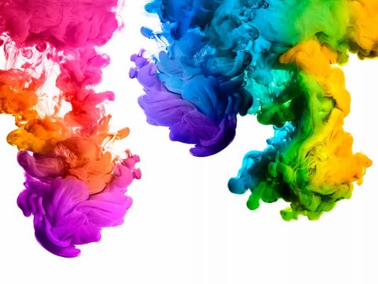
Put simply, colour doesn’t really exist. It is nothing more than the reflection of certain light waves picked up by our optic nerves and transmitted through nerves to our brain. We are predisposed to give meanings to these colours.
To explain further, within the spectrum of visible light there are physiological effects. Colours with long wavelengths, such as red, have a faster recognition response in the brain, and colours with shorter wavelengths, such as blue, elicit a lower pulse, blood pressure and breathing – which may explain why it often tops the list of the world’s favourite colour.
The same is true for other colours in the spectrum. Yellow sits in the middle of the wavelengths as it is the brightest and draws the most attention. This explains why the colour is used for road signs.
What is means for your branding
Consider your messaging and target market when choosing the colour(s) to represent your brand. What do you want your customers to think when they see your name? Do you want to be seen as bold and powerful, trustworthy or environmentally conscious? Although the answer may be ‘all of the above!’, it is important to remember that 51% of the Forbes Top 100 Most Valuable Brands use just one colour.
When looking at airlines, blue and red are the two most commen colours for logos. Red, to demonstrate reliability and dominance, and blue to provide a sense of calm and security.
The takeaway
When picking a colour scheme or logo design for your company, there are many things to consider, but essentially you should select a colour that represents the emotion you want to portray and the perception you want potential customers to have about you.
And if in doubt, go with blue, everyone likes blue.